Quick Summary: Association Newsletters
- Subject lines are gatekeepers: Keep under 50 characters, personalize with names, front-load key words, and A/B test approaches to maximize opens.
- Design for scanning: Use clear headers, short paragraphs, bullet points, white space, and a consistent structure members can navigate in seconds.
- Lead with member value: Start with educational content, resources, or industry insights—save organizational news for a brief section near the bottom.
- Mobile-first is essential: Over half of emails open on phones; use single-column layouts, large tap targets, and compressed images.
- Track and refine: Monitor open rates (20%+ goal), click-throughs (2%+), and unsubscribes (<0.5%) to continuously improve performance.
Part of our complete email marketing guide
These association newsletter tips will help you create emails members actually read. With lack of engagement a top reason members lapse, every newsletter is an opportunity to demonstrate value.
The difference between newsletters that get ignored and those that get read isn't luck—it's strategy. Great newsletters deliver value, respect members' time, and create genuine engagement. Modern email marketing tools make it easier than ever to segment, personalize, and automate your newsletter program.
After nearly 30 years working with associations, I've noticed something: the organizations with the best member retention almost always have great newsletters. Not flashy newsletters. Not long newsletters. Just consistently valuable ones that respect members' time. Whether you're launching your first newsletter or revamping an existing one, these proven tips will help you create newsletters that members actually look forward to receiving.
Start with a compelling subject line
Your subject line is the make-or-break moment that decides if members open your newsletter or hit delete within seconds, especially since busy professionals scan inboxes in under 10 seconds. Personalized, value-packed lines under 50 characters boost opens by highlighting resources, events, or insights members can't ignore. Mastering this grabs attention immediately, setting the stage for everything else in your newsletter to land effectively.

Subject line best practices:
- Keep it under 50 characters (mobile preview length)
- Avoid spam trigger words (FREE, ACT NOW, !!!)
- Be specific rather than generic
- A/B test different approaches
- Front-load important words (subject lines get cut off)
Pro Tip: Avoid using "Newsletter" in your subject line. It's generic and tells members nothing about the value inside.
Create a scannable layout
Members don't read newsletters word-for-word—they scan for relevance in seconds, so a cluttered design sends them away while clean, predictable structure keeps them engaged. A modern email marketing platform simplifies creating templates with headers, bullets, and white space that guide eyes to high-value content first. This approach respects time constraints, improves retention of key messages, and builds familiarity so members anticipate and trust future issues.
Design for scannability:
- Clear section headers - Use descriptive headlines that reveal content
- Hierarchy of importance - Lead with your most valuable content
- Short paragraphs - 2-3 sentences maximum
- Bullet points - Break up dense information
- White space - Don't cram everything together
- Consistent structure - Same sections in the same order each time
- Visual elements - Images, icons, or colored boxes to break up text
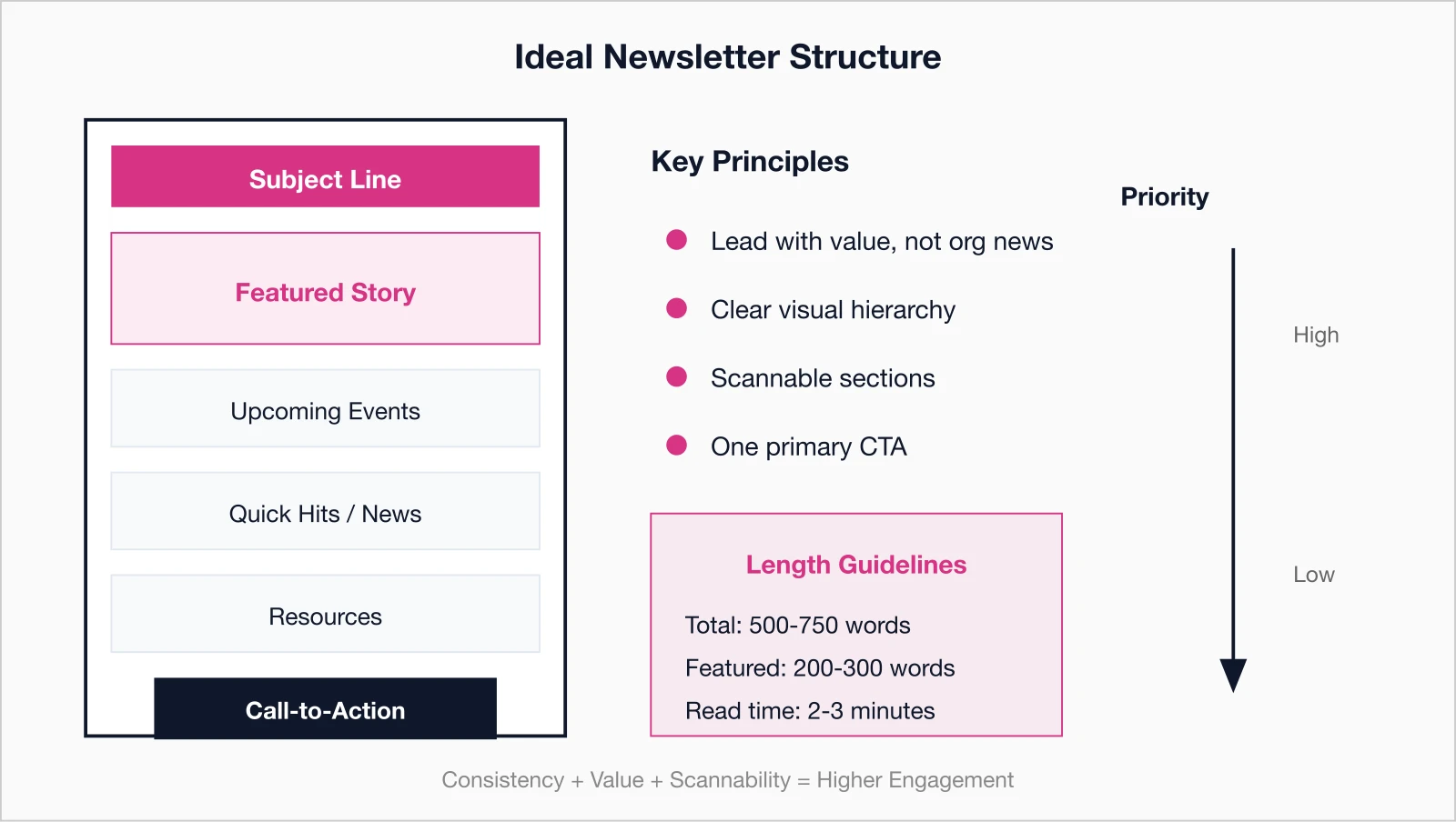
Recommended newsletter structure:
- Brief greeting or editor's note
- Featured story or main announcement
- Upcoming events (next 2-3)
- Member spotlight or success story
- Industry news or insights
- Quick hits (brief news items)
- Resources or benefits reminder
- Clear call-to-action

Lead with value, not organizational news
Starting with organizational news like board minutes buries the lede, but leading with member benefits—tips, resources, or insights—proves your newsletter's worth right away. According to Sequence Consulting's 2026 Association Trends Report, weak value propositions contribute to disengagement, so prioritize educational content, exclusive data, and career tools that deliver immediate ROI. This member-first strategy flips newsletters from interruptions to must-reads, directly tying into higher retention and loyalty.

High-value newsletter content:
- Educational content - Tips, how-tos, best practices they can use immediately
- Exclusive resources - New templates, toolkits, or research
- Industry insights - Trends, data, or analysis they can't get elsewhere
- Networking opportunities - Events or connections with peers
- Career advancement - Job postings, professional development
- Member success stories - Inspiration and proof of value
- Discounts and perks - Member-only benefits and partner offers
Lower-priority content:
- Board meeting minutes
- Staff updates and organizational structure changes
- Long-winded messages from leadership
- Inside baseball that only board members care about
Save organizational news for a small "From the Executive Director" section near the bottom, not the lead story.
Keep it concise
Respecting members' packed schedules means delivering punchy, actionable content in 500-750 words max, using teasers and links to avoid overwhelming inboxes with walls of text. Long-winded issues get skimmed or deleted, but focused formats—short paragraphs, bullets, and clear CTAs—drive clicks to your site for deeper dives. Aim for 2-3 minute read times to boost completion rates, ensuring every word advances engagement or action without filler.
Length guidelines:
- Total newsletter: 500-750 words (2-3 minutes to read)
- Featured article: 200-300 words with link to full version
- News items: 50-75 words each
- Event listings: Date, time, brief description, registration link
How to keep it concise:
- Use teasers that link to full articles on your website
- Trim unnecessary words and filler
- Get to the point in the first sentence
- Use bullet points instead of paragraphs when possible
- Link to more information rather than including everything
Remember: The goal of your newsletter is to drive action (visit website, register for event, download resource), not to be comprehensive.
Optimize for mobile devices
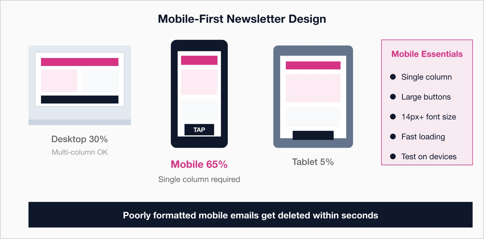
With over half of emails opened on phones, non-responsive designs frustrate users and tank engagement, as small text and tiny links lead to instant closes. Mobile-first means single-column layouts, tappable buttons, and fast-loading images that render perfectly on any screen size. Testing across devices ensures your newsletter performs seamlessly, capturing the majority of opens and turning mobile moments into meaningful interactions.
Mobile optimization checklist:
- Single-column layout - Avoid complex multi-column designs
- Large, tappable buttons - Minimum 44x44 pixels
- Readable font size - At least 14px for body text
- Short subject lines - Mobile preview is 30-40 characters
- Compressed images - Fast loading even on slower connections
- Brief preview text - First sentence should hook readers
- Test on multiple devices - iPhone, Android, tablets

Include strong calls-to-action
Without clear CTAs, even great content fails to convert reads into registrations, downloads, or renewals—your newsletter's true purpose. Action-oriented buttons like "Register Now" or "Download Guide," placed prominently with urgency, guide members effortlessly to next steps. Limit to one primary CTA per issue for focus, using contrasting colors and personal language to lift click-through rates and measurable results.

CTA best practices:
- One primary CTA - Your main goal for this newsletter
- Action-oriented language - "Register now," "Download guide," "Read more"
- Button format - More visible and clickable than text links
- Contrasting colors - Buttons should stand out from background
- Placed prominently - Above the fold and repeated if newsletter is long
- Create urgency - "Early bird ends Friday" or "Limited spots available"
Common CTAs for membership newsletters:
- Register for upcoming event
- Renew membership
- Download new resource
- Read full article on website
- Join discussion in member forum
- Complete member survey
- Update your profile
Use visuals strategically
Visuals break up text and boost appeal, but random stock images distract while purposeful ones—like event photos or infographics—reinforce messages and draw eyes to priorities. Compress files for speed, add alt text for accessibility, and align with your brand for professionalism that builds trust. Strategic use enhances scannability and retention, making complex info digestible at a glance without overwhelming the design.
Effective visual elements:
- Featured image - Eye-catching header image for main story
- Headshots - For member spotlights or expert contributors
- Event photos - Show what members missed or can look forward to
- Infographics - Visual representation of data or processes
- Icons - Small visual cues for different sections
- Product images - For new resources or member benefits
Visual best practices:
- Compress images for fast loading
- Include alt text for accessibility
- Don't rely on images to convey critical information (they may not load)
- Maintain consistent style and quality
- Use authentic photos over stock images when possible
Personalize beyond the name
Generic blasts feel like spam, but tapping member data for tailored content—like event recommendations or milestone nods—makes newsletters feel custom-built. Integrated membership management software unlocks details on status, location, or behavior for relevance that spikes opens and clicks. This deeper personalization fosters connection, turning routine sends into conversations that strengthen loyalty.
Here's something I've seen work particularly well: member anniversary acknowledgments. When someone hits their 5-year or 10-year membership anniversary, a simple "Thank you for being with us" in the newsletter—even just a line—creates genuine goodwill. It costs nothing but reminds members they're valued individuals, not just database entries.
Personalization opportunities:
- Member name and greeting - "Hi [FirstName]"
- Membership status - "Your membership renews in 60 days"
- Location-based content - Regional events or chapter news
- Industry or specialty - Relevant content for their profession
- Past behavior - "You registered for last year's conference..."
- Milestones - Anniversary or achievement recognition
- Recommended content - Based on interests or past engagement
Maintain consistent timing
Inconsistent sends erode habits, but sticking to a predictable schedule—like Tuesdays at 10am—trains members to anticipate and prioritize your newsletter amid inbox chaos. Midweek mornings yield peak opens, with bi-weekly hitting the sweet spot for most associations to balance value and fatigue. Testing refines your rhythm, building reliability that compounds engagement over time.

Frequency recommendations:
- Weekly: For highly active communities with constant news and events
- Bi-weekly: Sweet spot for most associations
- Monthly: Minimum to stay top-of-mind
Best days and times:
- Tuesday-Thursday: Generally best open rates
- Mid-morning (9-11am): When professionals check email
- Avoid Mondays: Inbox overload
- Avoid Fridays: Weekend plans take priority
Test different days and times with your audience to find what works best for your members.
Consistency Matters: Members should know to expect your newsletter every Tuesday at 10am (or whatever schedule you choose). This builds routine and improves open rates.
Track performance and improve
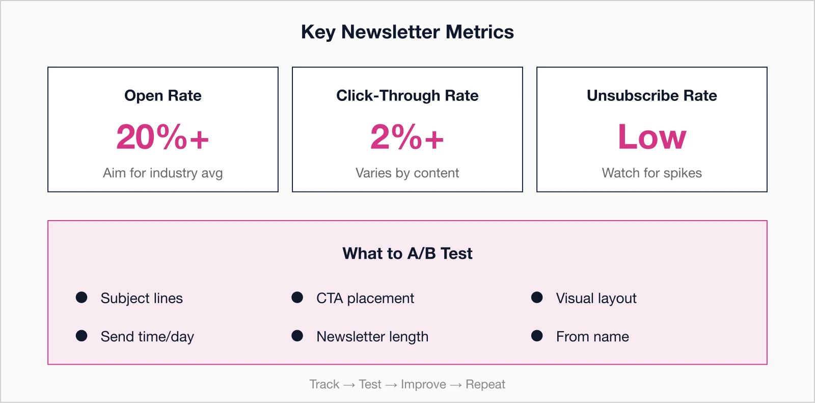
Data reveals what resonates, letting you refine subject lines, timing, and content for continuous gains rather than guessing. Robust analytics and reporting tools track opens (aim for 20%+), clicks (aim for 2%+), and unsubscribes, plus A/B tests on key variables. Regular reviews turn insights into tweaks, steadily lifting metrics and proving your newsletter's ROI.
Key metrics to monitor:
- Open rate: Percentage who opened (aim for 20%+ depending on your industry)
- Click-through rate: Percentage who clicked links (aim for 2%+ depending on content)
- Click map: Which links get the most clicks
- Unsubscribe rate: Should stay below 0.5%
- Forwards/shares: Indicates especially valuable content
- Device breakdown: Mobile vs desktop opens
What to test:
- Subject lines (A/B test every issue)
- Send time and day
- Content mix (more educational vs more event promotion)
- Newsletter length
- Visual elements and layout
- CTA placement and wording

Common newsletter mistakes to avoid
Pitfalls like over-promotion, irregular sends, or desktop-only designs sabotage even solid content, driving unsubscribes and disengagement. Spotting these early—such as boring subjects or missing CTAs—prevents damage, keeping your program on track. Addressing them head-on ensures newsletters build value instead of clutter.
- Being too promotional - Every newsletter shouldn't be a sales pitch
- Irregular sending - Going silent for months then sending three in a week
- Too much content - Overwhelming members with information overload
- Boring subject lines - "March Newsletter" tells members nothing
- No clear purpose - Sending content just to send something
- Ignoring mobile - Assuming everyone reads on desktop
- Weak or missing CTAs - Not guiding members to take action
- One-way communication - Not encouraging replies or engagement
- Poor quality control - Typos, broken links, formatting errors
Pre-send newsletter checklist
A quick pre-send review catches issues like broken links or mobile glitches that undermine credibility and waste sends. Running through subject lines, personalization, CTAs, and tests across devices guarantees polish. This habit elevates quality, maximizes impact, and sets every issue up for success.
- Compelling subject line (under 50 characters)
- Preview text optimized (first sentence hooks readers)
- Lead with value, not organizational news
- Clear section headers and scannable layout
- Mobile-friendly design
- All links work and go to correct destinations
- Images load properly with alt text
- Strong, clear call-to-action
- Personalization tokens working correctly
- Proofread for typos and errors
- Unsubscribe link present and functional
- Sent test email to yourself on multiple devices
Transform your newsletter from ignored to anticipated
A well-crafted newsletter is one of your most cost-effective member engagement tools. It keeps your organization top-of-mind, demonstrates ongoing value, and drives members to take action.
Start improving today:
- Audit your last three newsletters against these tips
- Identify your top 3 areas for improvement
- Implement one new strategy per month
- Track your metrics to measure improvement
- Survey members to ask what they want to see
Remember: Great newsletters aren't created overnight. They're refined over time through testing, feedback, and continuous improvement. Start implementing these tips today, and watch your open rates, click-throughs, and member engagement climb.
One final thought: I've worked with associations that obsess over open rates and click-throughs, and ones that barely track anything. The sweet spot is somewhere in the middle. Pay attention to your metrics, but don't lose sight of why you're sending the newsletter in the first place—to serve your members. If you focus on delivering genuine value in every issue, the numbers tend to follow.
Key takeaways
- Segmentation boosts engagement: Newsletters targeted by member interests, demographics, or behavior consistently outperform one-size-fits-all approaches on both open rates and click-throughs
- Subject lines make or break open rates: Keep subject lines under 50 characters, personalize with member names, and A/B test different approaches to find what resonates with your audience
- Mobile optimization is non-negotiable: Over half of emails are opened on mobile devices, so responsive design, single-column layouts, and large tap targets are essential for engagement
- Optimal frequency balances value and inbox fatigue: Most successful associations send newsletters weekly or bi-weekly—monthly is often too infrequent while daily creates unsubscribes, with consistency being more important than frequency
Create Better Newsletters with i4a
i4a's all-in-one AMS includes email marketing tools with customizable templates, segmentation, personalization, mobile optimization, and detailed analytics—everything you need to create newsletters members love.
Ask About Email Marketing ToolsRelated resources
Comprehensive guide to membership databases, automated renewals, self-service portals, and choosing the right membership software.
Learn how AMS platforms combine membership, events, email, and payments in one integrated system for associations.
Association Member Communication Best Practices
Comprehensive guide to effective member communication strategies.
How to Reduce Membership Churn: 10 Proven Strategies for 2026
Keep members engaged and committed through strategic communication.
